The Dashboard Configuration page in the Cora PPM Administration section is the central control panel that governs how every type of dashboard in the system looks and behaves for end-users. It allows system administrators to decide which widgets are visible, which appear by default, how many widgets a user can place simultaneously, and which user groups are permitted to see each widget. It also controls whether dashboards appear in the top navigation menu, and provides detailed settings for the Executive and Strategy dashboards including their filters, timeline, and list view columns.
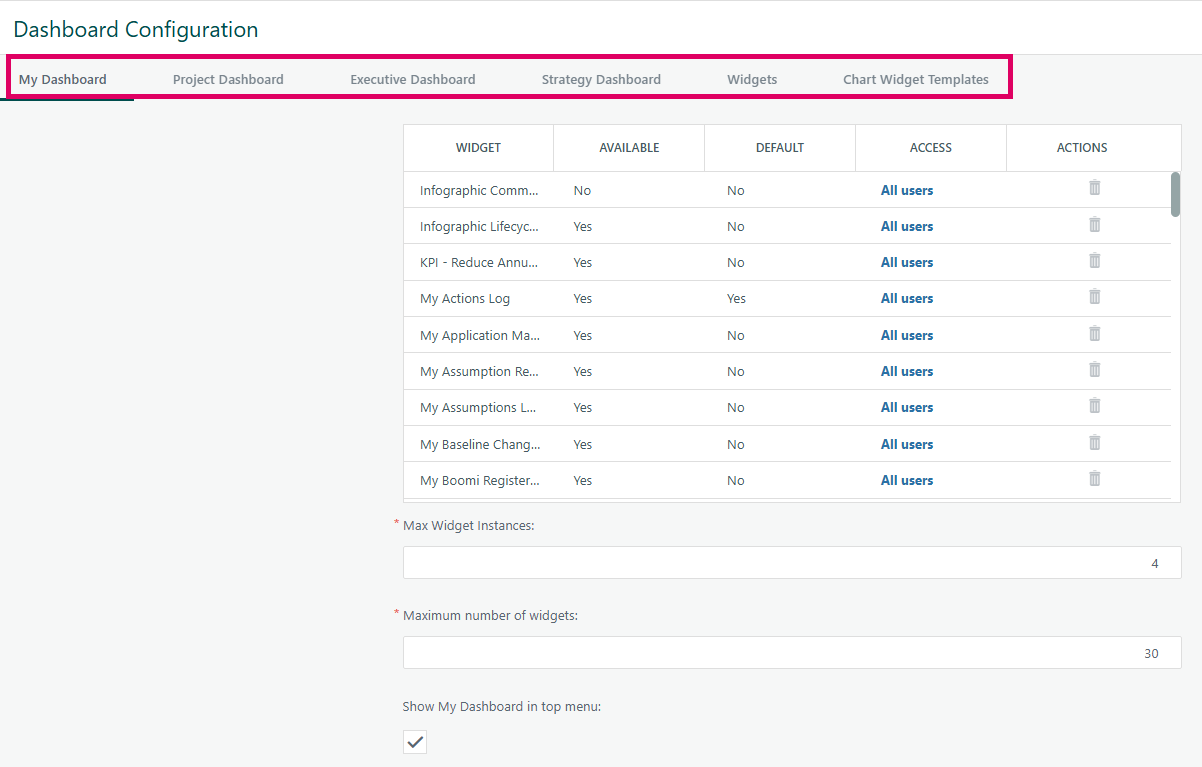
The page organises its settings into seven distinct tabs, each focused on a specific dashboard type or category:
Administrator Configuration
Admins configure all Dashboards at Administration → Configuration → Dashboards → My Dashboard tab:
- Mark widgets as Available (users can choose to add them) and/or Default (they appear for users automatically).
- Set the maximum number of widgets a user can display simultaneously.
- Set the maximum number of instances of a repeatable widget
- Restrict individual widgets to specific user groups via the widget access grid.
- Configure Infographic widgets on the same screen.
Executive Dashboard Configuration page
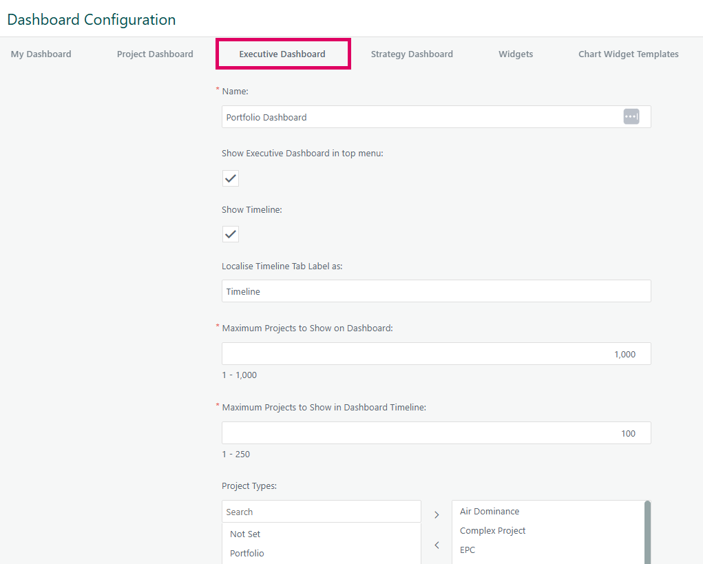
The Executive Dashboard Configuration page is a system administration interface in Cora PPM that allows administrators to control every aspect of what the Executive Dashboard looks like, what data it surfaces, and how users can interact with it. It lives inside the broader "Dashboard Configuration" admin area, which governs multiple dashboard types (My Dashboard, Project Dashboard, Savings Dashboard, Executive Dashboard, Strategy Dashboard, Widgets, and Chart Widget Templates) — each on its own tab.
What It Controls
The Executive Dashboard tab covers seven distinct areas:
- Display & Naming
Administrators can rename both the Executive Dashboard menu item and the Timeline sub-view to any custom label. A toggle controls whether the Executive Dashboard appears at all in the application's top navigation menu.
- Project Volume Limits
Two numeric limits govern performance and usability:
- Maximum Projects to Show on Dashboard — caps how many projects appear in the list view. By default this is 1,000, but a feature toggle (
ExceedDashboardLimits) can raise this to unlimited. - Maximum Projects to Show in Timeline — caps timeline rendering (default 250, or 500 when the feature toggle is on). This field becomes mandatory only when the Timeline is enabled.
- Filter Panel Configuration
A swap-list control lets administrators choose which filter dimensions appear in the Executive Dashboard's filter panel. Available options include: Strategies, Organisations, Project Phase, Project Type, Project Status, Projects (direct project selection), and — when the Copeland Availability by Demand toggle is on — Scenarios. Only the dimensions moved into the "selected" side appear for end users. When Strategies, Organisations, or Projects filters are selected, an additional checkbox "Auto Select Sub Items" becomes visible, which determines whether child items are automatically selected when a parent is chosen.
- Project Type Restriction
A separate swap-list lets administrators restrict the Executive Dashboard to only show projects of specific types. Types marked as "Not Set" (meaning no project type) are also included as an option.
- List View Columns (Configurable Grid)
The most powerful section is the draggable column configurator for the list/grid view. Administrators can:
- Add columns by selecting a field type and specific field. Four column types are supported: Project Field (built-in project attributes), Smart Form Field (custom fields from the Smart Form builder), Register Count (count of open or all items in a custom register), and Project Financial (budget/forecast/actuals for specific years relative to current year).
- Remove columns with a delete button (changes are staged until Save is clicked).
- Reorder columns by dragging and dropping rows within the grid.
- Edit column behaviour — each column can be configured with a Popup action (what happens when a user clicks on the value in a cell: Direct Update, Project Documents, Smart Form modal, Open/All register items, or Nothing) and a Navigate To destination (the project sub-page, Smart Form page, or custom register a user lands on when clicking to navigate).
- Certain columns support "Direct Update" popups: Status, Phase Status, Strategy, Priority, Risks, Issues, Opportunities, Organisation.
- Bad/orphaned columns (those referring to deleted fields) are automatically cleaned up on page load.
- Number of Frozen Columns can be set (max 4; currently limited to a specific customer).
- Timeline View Columns
A separate, parallel column configurator exists for the Gantt/Timeline view. It works identically to the List View column grid but, because it is a read-only timeline, only Type and Field can be set — Popup and Navigate To are disabled for timeline columns.
- Widget Access Grid
A grid lists every dashboard widget registered for the Executive Dashboard. For each widget, administrators can set:
- Available — whether the widget is offered to users at all.
- Default — whether the widget is on by default on a fresh dashboard.
- Access (Group Restriction) — clicking the link opens a modal popup (
ExecutiveDashboard_Configure_Widget_GroupAccess.aspx) where specific user groups can be granted or denied access to that widget. This is a per-widget group access control layer on top of the available/default flags.
- Apply Grid Filters
A checkbox (cbApplyGridFilters) controls whether grid-level column filters applied in the list view are also propagated to widget and timeline views.
- Widget Settings (Shared "Widgets" Tab)
The page also hosts a "Widgets" tab (shared with other dashboard types) covering:
- Financial Widget column selector — which financial columns (Estimate, Actuals, Budget, Commitments, Forecast, Cost Impact, etc.) appear in the financial widget. This is driven by the system's Financial Management configuration.
- Infographic Widget management — an add/archive/delete grid for infographic widgets, controlled by the
Infographicfeature toggle. - Run Rate Widget label customisation — administrators can relabel every column of the Run Rate Widget (Month, Target Person, Actual Cost, etc.) for localisation purposes.
10. Chart Widget Templates (Shared "Charts" Tab)
Administrators can add, edit, copy, and delete chart widget templates. Templates define the chart's year, whether to show totals/legend, axis scale, currency, dimensions, and the series rows/columns.
All changes are saved atomically when the Save button is clicked. Every change is written to an audit history log (configuration history), ensuring full traceability.
Strategy Dashboard Configuration
The Strategy Dashboard Configuration page is the administrator-facing control centre for the Strategy Dashboard — a portfolio-level dashboard that groups and filters projects through a strategic lens (by strategy, project type, project status, project phase, and individual projects). It lives as a dedicated tab within the broader Dashboard Configuration page (Configuration_Dashboards.aspx), which is a tabbed administration screen covering all Cora PPM dashboards in one place.
The Strategy Dashboard itself (Strategy_Dashboard.aspx) is a dynamic, grid-stack–based widget board. Users can filter by strategy hierarchy, project stage, project type, project status, and specific projects; the dashboard then recalculates and reloads its widget panels automatically whenever a filter selection changes. Each widget (Risks, Summary, Milestones, Projects, Financial Management, Tasks, Issues, Opportunities, Benefit Analysis, Overall Progress, etc.) is independently positioned and sized by the individual user, with positions saved server-side per user.
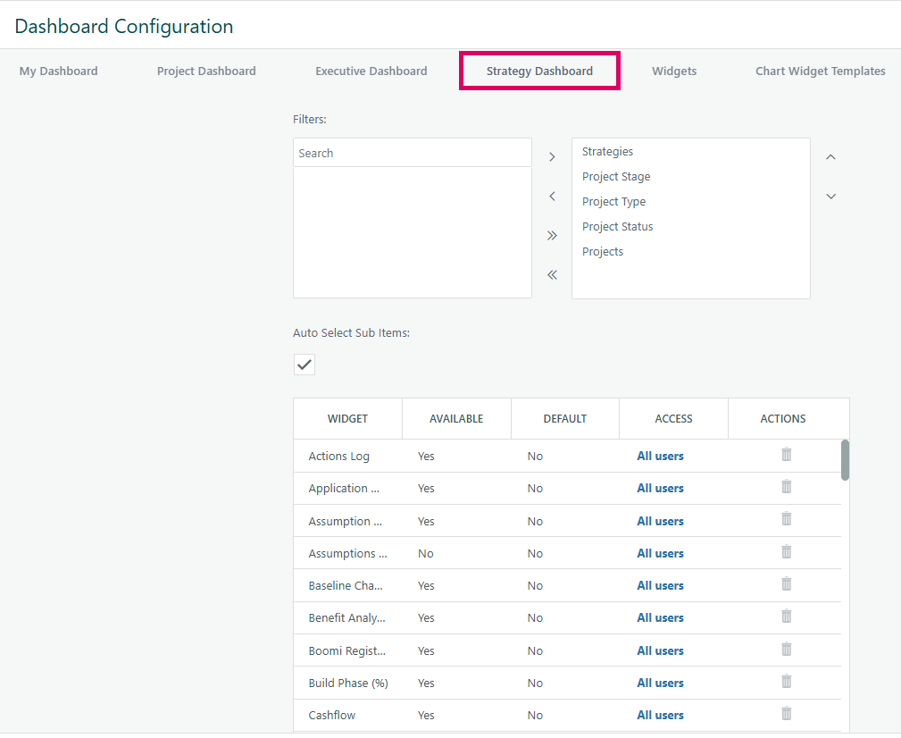
The configuration page (the "Strategy Dashboard" tab in Configuration_Dashboards.aspx) controls four distinct things:
- Filter visibility and order — an administrator selects, via a swap-list, which of the five possible filter controls (Strategies, Project Phase, Project Type, Project Status, Projects) appear on the live Strategy Dashboard, and in what order. The order of items in the swap list directly determines the rendered CSS
orderproperty of each filter container. - Auto Select Sub Items — a checkbox that, when enabled, causes the Strategies drop-down to automatically check child nodes when a parent strategy is chosen, and causes the Projects drop-down to automatically include sub-projects. This checkbox only becomes visible when the Strategies or Projects filter is included in the selected filter set.
- Widget catalogue management (Available Widgets / Default Widgets) — a dual swap-list lets administrators decide which widgets are globally available to Strategy Dashboard users, and which of those available widgets appear by default when a user has never customised their layout. Only available widgets can be nominated as default.
- Widget group access restrictions — each widget in the catalogue has an "Access" column. Clicking it opens a modal popup ("Widget Group Access") where the administrator restricts that widget to specific security groups. Users who do not belong to any of the listed groups will not see the widget at all on their Strategy Dashboard.
All configuration changes are saved by clicking the single page-level Save button, which persists every section (filter settings, widget lists, and dashboard-level capacity settings such as maximum widget count and maximum widget instances) in a single transaction. Every change is written to the audit history log.
The Strategy Dashboard tab is entirely feature-gated: if the Strategies feature flag is disabled in the system's FeatureConfiguration, the tab is hidden from the configuration page and the dashboard itself is unavailable. The tab's label is also localised — it reads "[STRATEGY_MAJ] Dashboard" to respect any customer-level terminology override for the word "Strategy".
Widgets
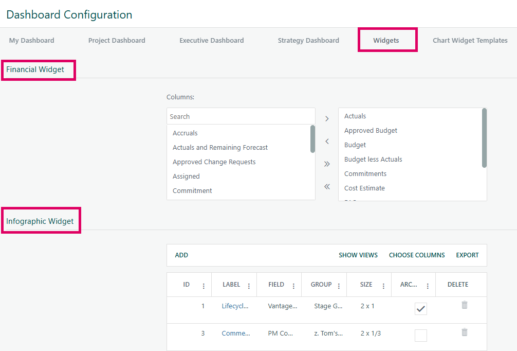
The Widgets tab on the Dashboard Configuration page contains two distinct configuration sections that administrators use to control how financial and infographic data are presented across dashboards.
Section 1 — Financial Widget column picker: This is a dual-panel "swap list" control that lets administrators choose which financial columns (such as Actuals, Budget, Commitments, Cost Estimate, Approved Budget, etc.) appear inside the Financial Management Widget on project, programme, and portfolio dashboards. Columns in the left panel are available but not currently shown; columns in the right panel are actively selected and will appear in the widget. Administrators move items between panels using the arrow buttons, and a search box helps find specific columns quickly. This section only appears when Financial Management is enabled in the system.
Section 2 — Infographic Widget grid: This is a management table listing all configured Infographic Widgets in the system. Each row represents a single infographic definition, showing its ID, label, the data field it measures, the group it belongs to, its size (expressed as height × width proportions), an archive checkbox, and a delete button. Administrators can add new infographic widgets via the ADD button (which opens a popup editor), archive existing ones by ticking the checkbox, delete ones that are not in use, and export the list. Clicking a label opens that infographic's edit popup.
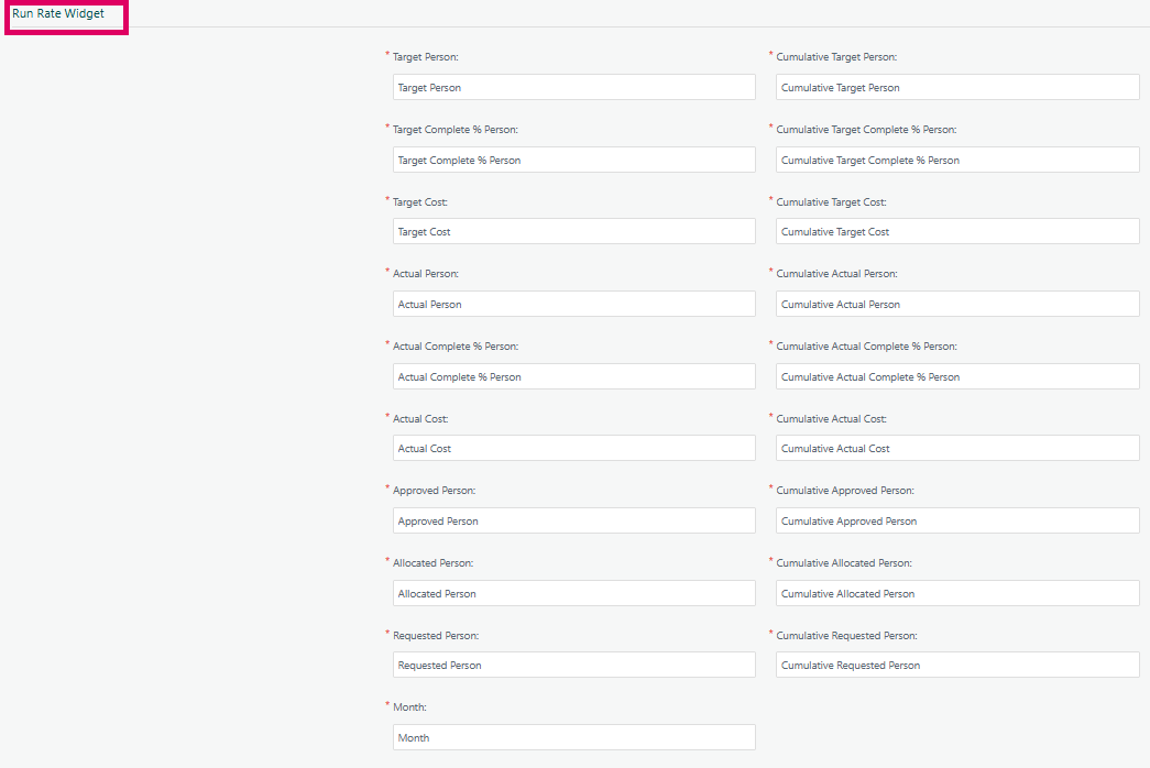
The Run Rate Widget configuration screen in Cora PPM is the settings panel that controls how the Run Rate Widget collects and displays resource planning data on a project or executive dashboard. It is not a "field mapping" form in the sense of mapping external data-source columns to internal fields — the labels and values shown in the screenshot reflect the column header labels (and their localizable display names) that will appear in the widget's expandable data grid, alongside the chart.
The Run Rate Widget is a resource effort tracking tool. It displays how planned (Target), actual, allocated, approved, and requested person-time (and optionally cost) are trending over a configurable date range, month by month. Every label in the configuration screen — Target Person, Actual Person, Approved Person, Allocated Person, Requested Person, Month, and all their Cumulative counterparts — corresponds directly to a column in the widget's underlying data grid. When the widget is placed on a dashboard, those labels become the column headers in that grid (and legend labels in the chart).
The field label / value pairs seen in the screenshot are not user-editable mapping dropdowns: they are the widget's internalized column-header names, which are localizable strings drawn from the system's translation catalogue. In English, each label defaults to its own name (e.g., "Target Person" maps to the text "Target Person"). The purpose of exposing them on the settings screen is to allow per-environment or per-language renaming via the Cora PPM localization framework.
The actual settings a user controls are found in the settings dialog (RunRateSettings.aspx), which sits above these column-label mappings and governs:
- Widget Title – free-text name shown in the dashboard.
- Show (swap-list) – which data series (Actual, Target, Allocated, Approved, Requested, Delta, and optionally Target Complete %, Actual Complete %, Target Cost, Actual Cost) are visible in the chart and grid.
- Date range – the calendar span over which data is fetched (from/to, with optional project-duration preset and a 5-year maximum).
- Show Cumulative Values – whether to display the running-total columns alongside the period-by-period columns.
- Display Time (feature-toggled) – unit for person-time: FTE months, Hours, or Days.
- Exclude Non-Production Tasks (feature-toggled) – whether non-production tasks are excluded from calculations.
- Detail Display / Show Data By / Account Sub Groups / Account Codes (feature-toggled) – account-code–level filtering for the Bravida/General Reporting Requirements feature flag.
The right-hand column of the screen shown in the screenshot ("Cumulative Target Person", "Cumulative Actual Cost", etc.) is the mirror of the left-hand column: for every period-level measure, there is a cumulative running-total measure, produced in the backend by accumulating each month's value as data is fetched from the database.
Purpose: Control which financial data columns are displayed in the Financial Management Widget across dashboards.
Prerequisites:
- You must have administrator access to Dashboard Configuration.
- The Financial Management feature must be enabled (Admin → System Configuration). If it is not enabled, this section is hidden entirely.
How to use:
- Navigate to Admin → Dashboard Configuration → Widgets tab.
- Under Financial Widget, you will see two panels labelled "Available" (left) and "Selected" (right).
- To add a column to the widget: select it in the left panel and click the single right arrow (→), or click the double right arrow (→→) to add all available columns at once.
- To remove a column: select it in the right panel and click the single left arrow (←), or click the double left arrow (←←) to remove all.
- Use the search box above the left panel to quickly find a specific column by name.
- Click Save at the bottom of the page to apply your changes.
Available columns depend on your configuration. For example:
- Actuals, Budget, Cost Estimate, Commitments, and Forecast columns appear only if those respective financial management sub-features are enabled.
- CostBook-specific columns (Approved Change Requests, Assigned, Accruals, EAC, ETC, etc.) appear only if the CostBook feature is on.
- Approved Budget, Approved Change Requests, Pending Budget Transfers, and related columns are CostBook-specific.
Tips:
- Changes are saved together with all other Dashboard Configuration settings when you click the single Save button at the bottom of the page.
- All column selection changes are written to the audit history log.
Any refferance to Project Home Configuration for widgets is deprecated functionality
Chart Widget templates
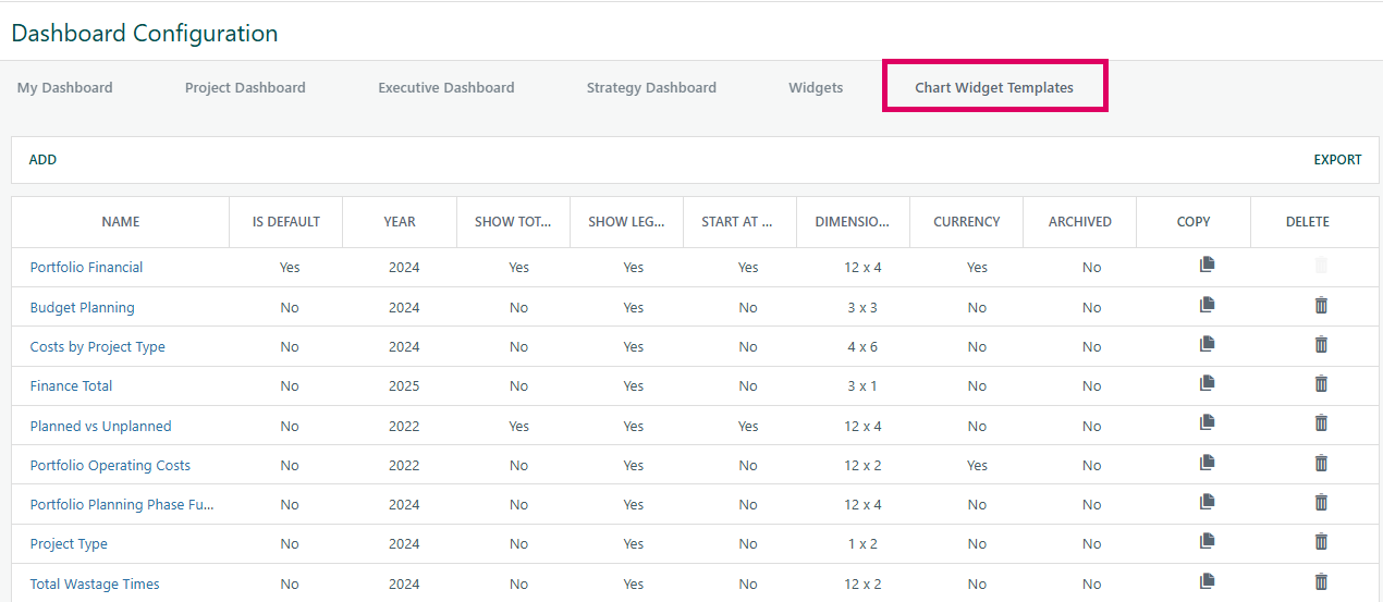
Chart Widget Templates are administrator-defined, reusable configuration blueprints that control exactly how a Chart Widget looks and what data it displays on any Cora PPM dashboard. Because a Chart Widget can be placed on the My Dashboard, Project Dashboard, or Executive/Strategy Dashboard, it must be pre-configured before users can see it — and that pre-configuration is what a "template" provides.
A template answers several key questions about the chart:
What data does the chart show?
Each template is built as a grid of rows and columns. The "dimensions" shown in the screenshot (e.g., 12 x 4 or 3 x 3) represent columns × rows. Columns define the horizontal groupings (either custom column headings, or the 12 calendar months for time-based charts). Rows define each data series in the chart, where each row specifies:
- What financial or custom metric to display — Actuals, Budget, Commitments, Forecast, Payments (and their cumulative equivalents), custom numeric fields, or month-by-month smart-form fields.
- Where the data comes from — the current widget's context (e.g., all visible projects), a specific project, a project with its sub-projects, or sub-projects only.
- How to visualise it — Line, Smooth Line, Column, Stacked Column (groups 1–4), Bar, Stacked Bar (groups 1–4), Area, Stacked Area, Donut, Pie, or Grid Only (no chart, appears only in the data table below the chart).
- What colour to use — with a colour-picker, defaulting to Cora's palette if not overridden.
- A label for the legend.
How is the chart displayed?
- Year — for time-series (month-based) rows, which year's data should be pulled.
- Show Legend — toggles the chart's legend.
- Show Totals — adds a transparent stacked series showing the combined total on top of stacked columns/bars.
- Start at Zero — forces cumulative financial series to begin from zero.
- Show Chart Labels — choose Labels (values shown on the chart), Tooltips (values on hover), or Neither.
- Abbreviate Values — shortens large numbers to
K/Mnotation with a configurable decimal-place count. - Currency flag — automatically computed: if any row uses Actuals, Budget, Commitments, Forecast, or Payments (row types
A,B,C,F,P), the template is flagged as currency-sensitive, meaning multi-currency conversion applies.
Lifecycle settings
- Is Default — exactly one template can be marked as the default; when a Chart Widget has no template selected, the default is used automatically. The default template cannot be deleted and cannot be archived without first designating a different template as the default.
- Archived — hides the template from widget settings drop-downs but keeps the historical configuration.
COPY and DELETE
- Each template can be copied (a new template is created as a clone, with the name cleared so the admin must give it a unique name).
- Templates can be deleted unless they are the default (the delete button is disabled and greyed out on the default row, as seen in the screenshot's "Portfolio Financial" row).
How templates connect to the live widget
When a Chart Widget renders on a dashboard, it looks up the template ID saved in that widget's settings. It loads the template's columns, rows, and display flags, fetches the relevant data from the database for the correct set of projects, builds the chart series, and then renders a Telerik HTML Chart plus an optional data grid below it. If multi-currency projects are included and no single currency conversion is set, the chart shows a "please select a currency" message instead of the chart.
Was this article helpful?
That’s Great!
Thank you for your feedback
Sorry! We couldn't be helpful
Thank you for your feedback
Feedback sent
We appreciate your effort and will try to fix the article