
The Cora PPM Gantt Toolbar is the primary action bar displayed across the top of the Gantt Chart view. It gives users immediate access to every major structural and visual operation they can perform on a project schedule, without navigating away from the chart. The toolbar is shared between the Gantt and WBS (Work Breakdown Structure) views, adapting its button availability based on which view is active.
The toolbar is organized into two sections: a left-hand group of task management and structural editing actions, and a right-hand group of display, export, and view-configuration controls.
Left-Hand Actions

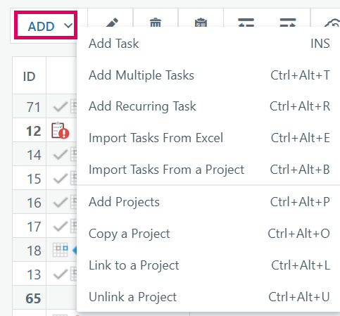
The Add button on the Gantt toolbar is the primary entry point for inserting new content into a project's schedule. It reveals a dropdown menu containing nine distinct actions, divided into two conceptual groups: task-level operations (the top group) and project-level structural operations (the bottom group), separated by a horizontal divider.
Task-Level Operations
Add Task (INS)
This is the fastest way to insert a single new task. When the user presses the toolbar button or the Insert key, a blank placeholder row immediately appears inline in the Gantt grid, directly above the currently selected task. The row drops into "inline edit" mode — the Task Name cell becomes an active text input. The user types a name and presses Enter to commit. The server inserts the task, schedules it, and returns a structured delta that the client uses to swap the placeholder for the real task — no page reload is required. Pressing Shift+Insert inserts the new task below the selected one (at the same hierarchy level, after its entire subtree). If no task is selected, the new task is appended at the end of the project.
Add Multiple Tasks (Ctrl+Alt+T)
Opens a popup dialog where the user can type any number of tasks in a batch — each row has a Task Name, Duration, Start Date, Finish Date, and an optional Resources link. Rows auto-grow as the user types or pastes. Pasting tab- or newline-delimited text (e.g. from a spreadsheet) fills multiple rows at once. The dialog also asks where to position the new tasks relative to the currently selected task: after it at the same level, as sub-tasks, or before it. Submission is also AJAX-based via
Task_BatchAdd, and the new rows appear in the grid immediately after the server confirms.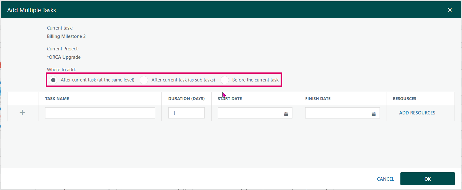
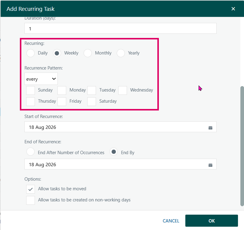
Add Recurring Task (Ctrl+Alt+R)
Opens a dialog specifically for tasks that repeat on a defined schedule. The user enters the task name, duration, and selects a recurrence pattern: Daily (every N workdays), Weekly (specific days of the week, every N weeks), Monthly (a specific date or day-of-week each month), or Yearly. The recurrence end is specified either by a number of occurrences or by an end-by date. Options also exist to allow tasks to be moved and to permit creation on non-working days.
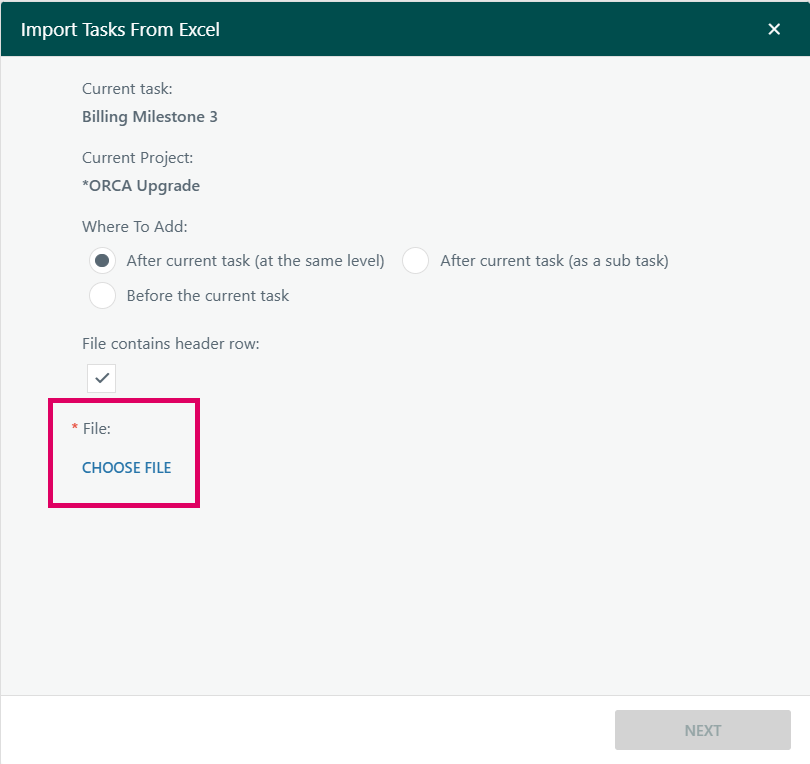
Import Tasks From Excel (Ctrl+Alt+E)
Opens an in-page iframe popup loading, which provides a guided Excel import experience. Tasks from a spreadsheet can be uploaded and mapped into the project schedule. The imported tasks are placed relative to the currently selected task (or at the end of the project if no task is selected).
Import Tasks From a Project
Opens another iframe popup, loading
AddItem.aspxwith thecopyprojectTasksoption. This allows the user to browse to an existing project and pull a copy of its tasks into the current project's schedule. The tasks are inserted relative to the current selection.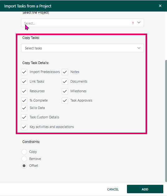

Edit (pencil icon) — Opens the full Task Manager panel (a sliding side-panel) for the currently selected task, giving access to every task attribute tab (resources, costs, risks, notes, documents, etc.). More detail can be found in the Task Manager page

Delete — Deletes the selected task(s). When tasks have actuals, the system warns the user. Deleted rows are removed via an asynchronous AJAX call without requiring a full page reload; the scheduler re-sequences remaining tasks automatically.

Copy to Clipboard — Copies the visible task list (with headers) in a tab-separated format suitable for pasting directly into Excel. The copy respects the currently selected tasks — if tasks are selected, only those rows are included.

Outdent / Indent (◄ ►) — Promotes (outdents) or demotes (indents) the selected task(s) within the WBS hierarchy. These operations are queued through a serialised AJAX mechanism to prevent race conditions, and the toolbar remains locked until each operation completes.

Restore Point (cloud icon) — Provides schedule save/restore functionality: users can create a named restore point of the current schedule, select a previous restore point to roll back to, or delete an existing restore point.

Expand / Collapse — The expand button opens a sub-menu offering Expand All, Collapse All, and individual expand/collapse. The collapse button immediately collapses all tasks to the top level.

Filter Dropdown — A multi-section dropdown that allows instant filtering of the task list:
- All Tasks — clears any active filter
- Slack — preset slack-threshold bands colour-coded red/amber/blue/green, thresholds configured per project
- Task Grouping — Active Parent Tasks, Active Milestone Tasks, Active Tasks, Inactive Tasks
- Critical Path — Critical Tasks, Longest Path, Secondary Path, Tertiary Path
- Active Task Status — Not Started, Started, On Hold, Complete, Not picking up Matrix rate
- Create Filter — opens a full filter builder popup
A context sub-menu on the filter icon toggles between Show Context and Hide Context (which determines whether tasks that are not direct filter hits but are ancestors/context of matching tasks are shown).

Views Dropdown — A saved-view selector. Users can switch between previously saved combinations of column layout, zoom level, filter, baseline selections, and colour scheme. Views can be shared with other users. A Manage Views dialog allows creating, editing, and deleting views.
Right-Hand Actions

Status Date (calendar icon) — Opens a popup to set or update the project's Status Date. This date is used as a reference marker on the bar chart and drives the out-of-sequence task detection. Changing the Status Date runs through the scheduler and may move tasks; a confirmation dialog with an impact count (tasks late to start / finish since the last status date) is displayed before applying the change.
Warning: Once a status date is changed it cannot be undone!

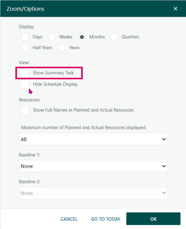
Zoom / Options (magnifying glass) — Opens a settings dialog controlling the timescale zoom (Days, Weeks, Months, Quarters, Half-Years, Years), display options (Show Today marker, Show Progress line, Show Summary task row, Show Full Resource Names), the maximum number of resource initials shown, baseline overlays (up to two baselines simultaneously), and whether to hide the schedule bar chart area entirely.

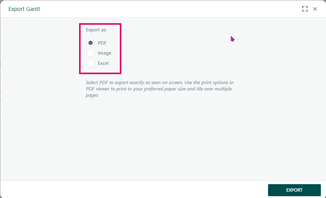
Export (arrow icon) — Opens an export dialog with options to export the Gantt as a PDF, image, or Excel spreadsheet. The Excel export respects the current column configuration and filter state.

Tooltips toggle — Toggles hover tooltips on/off globally. When enabled, hovering over task bars and icons reveals rich detail about dates, resources, baselines, constraints, approvals, and more.

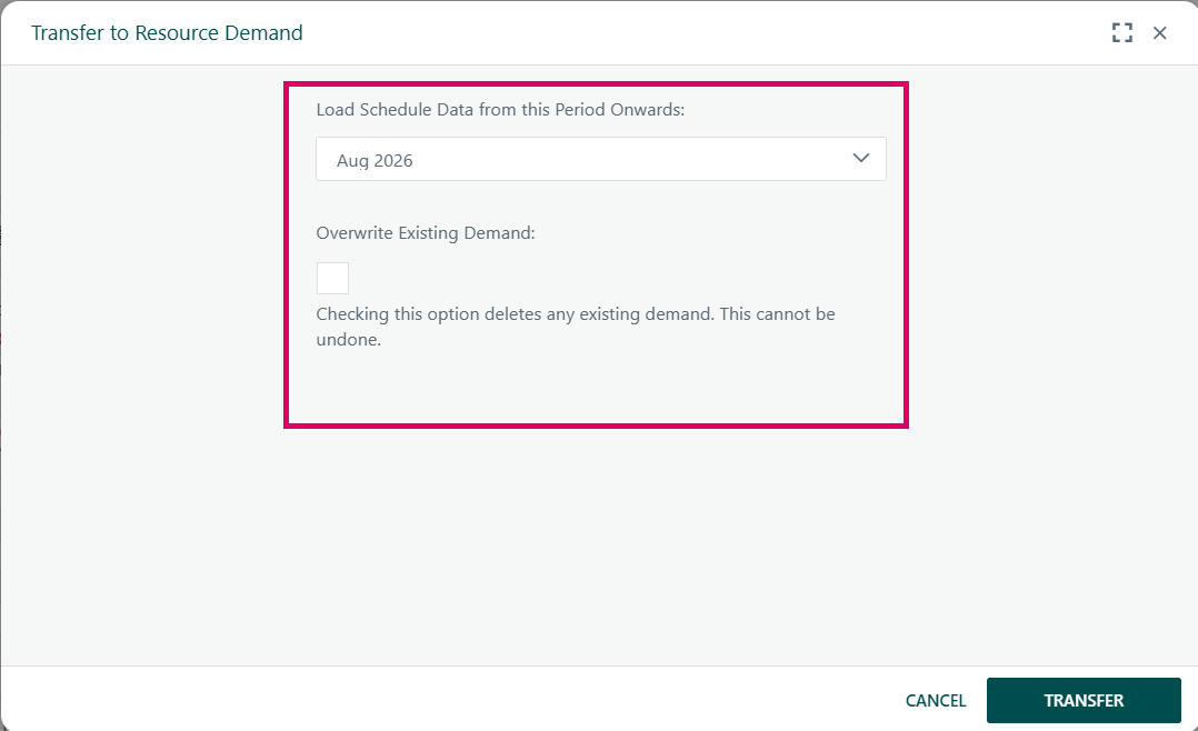
SCM Transfer (optional) (Also known as Resource Demand) — Appears only for Project Owners, Portfolio Managers, and Resource Managers when the Project Skill Planning feature is enabled. Opens a modal for transferring resource demand to the capacity management module.

Driving Path toggle — Highlights the driving path (chain of tasks that drive the current task's start) when a single task is selected, visually differentiating the linked chain from non-driving tasks.

Materials Link (optional) — Appears when there are unlinked materials on the project; navigates to the purchase order management page. Link
Refresh (circular arrow) — Appears after certain asynchronous saves to remind the user that the chart may not fully reflect the latest server state. Clicking triggers a full Gantt refresh.

Fullscreen — Expands the Gantt to take over the full browser viewport by collapsing the outer frame header and project summary bar, giving maximum screen real estate to the chart.


Colour toggle (Colour by Status / Colour by Slack) — A dropdown that switches the task bar colour scheme between colouring bars by task Status (each status has a configured colour) and colouring bars by Slack (threshold banding in the project's configured colours). A status/slack legend is displayed in the toolbar alongside whichever scheme is active.
Was this article helpful?
That’s Great!
Thank you for your feedback
Sorry! We couldn't be helpful
Thank you for your feedback
Feedback sent
We appreciate your effort and will try to fix the article