Project Registers: Administration - Matrices

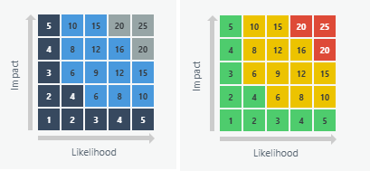
A matrix in a Cora PPM project register is a configurable two-dimensional grid (similar to a risk/impact matrix) that allows register records to be visually distributed across a colored heat-map style layout. Matrices are a purpose-built visualization tool for registers that have two single-select list fields — one field drives the horizontal (X) axis and another field drives the vertical (Y) axis. Each cell where those two axes intersect can be given its own color, score, score label, and tooltip text.
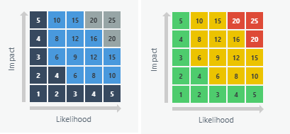
What a Matrix Is
A register matrix has:
- A name for identification.
- An X axis (called "Impact" label) and a Y axis (called "Probability" label), each with a configurable label.
- Two fields drawn from the register's single-select custom list fields — one mapped to the X axis, one mapped to the Y axis.
- A configurable size (grid dimensions), between 2×2 and 10×10 cells.
- Individual cell settings per grid cell: a numeric score, a score label (e.g. "High", "Medium", "Low"), tooltip text, and a background color.
- An archived flag so it can be retired without deletion.
Important: The matrices is only enabled after the register has been saved for the first time. You cannot add a matrices in “add new register” mode.
How Matrices Are Used
Once created, a matrix can be used in three different places:
- Dashboard widgets — A project register widget can be configured to display the matrix chart type instead of the standard donut/bar/column/treemap chart. When viewed, register records are plotted across the matrix cells based on their selected field values. Clicking a matrix cell filters the register grid to show only the matching records.
- Snapshot Reports — A flash report summary section can be configured to show the matrix chart as its visualization.
- Admin preview — While building or editing a matrix definition, a live preview of the matrix is shown within the configuration popup itself, and individual cells can be clicked directly from that preview to configure them.
The key concept is that the matrix provides a second, richer way to view the distribution of register records across two dimensions simultaneously — for example, plotting all risk records by their "Likelihood" (Y) and "Impact" (X) single-select fields, with each cell color-coded by severity.
Was this article helpful?
That’s Great!
Thank you for your feedback
Sorry! We couldn't be helpful
Thank you for your feedback
Feedback sent
We appreciate your effort and will try to fix the article